Author Archives: Rachel

Unknown's avatar

About Rachel

Media student @ LTU Follow my twitter: @rachelsmedium for everything news/media/design related

Challenge 3 – Panoramas (Week 20)

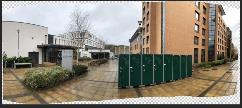
The last challenge I did was to take some panoramas, however, instead of using my phone to automatically do it, I took some individual vertical photos from left to right and compiled them onto Photoshop. I went around my university campus to get some great shots of the scenery around. I followed a map to get some really good shots.

map of area around university

Here are my raw, untouched, original photos I took.

Step 1: Photomerge

Once I had all my photos, I opened up Adobe Photoshop and clicked File>Automate>Photomerge. I selected the ‘auto‘ layout for my first panorama and then I clicked on ‘browse‘ and selected all my individual photos. Make sure the ‘blend images together‘ option is ticked in order to create a smooth panorama.

1. photomerge setup

Step 2: Levels and Hue/Saturation

After grouping the individual images of my panorama into a folder titled ‘Panorama 1’, I then modified the levels and hue/saturation of the image in order to make the image look more vibrant. I think this definitely made it more eye-catching and like it was took on a professional camera rather than a phone. You can do this by clicking on the ‘black and white’ tool in the adjustment settings above the layer window.

layers
grouped layers

Final step: Adding a frame

I lastly added a frame to complete the panorama. As my panorama came out smoothly, the frame perfectly fit around the piece. I added a frame by right clicking on the panorama layer and clicking on ‘add layers to frame’ and, in order to modify the border of this, I clicked on Layer>Layer Style and then onto ‘Stroke‘ and I made the border black and more thick. I think this panorama is my best one out of all as it came out so smoothly and looks almost professional.

initial panorama before frame and hue/saturation modifications
final panorama image

My other panorama images:

My other panorama images didn’t turn out as smoothly as the first one, however I do think they show a clear image of the area. I enjoyed creating the panoramas overall as it was quick and easy to do but it was also amazing to see how the individual images could be automatically created into a flawless panorama on Photoshop.

university entrance
university’s running track
Trinity close

Challenge 2: NZ Wine Label (Week 19)

For this task, I created two wine labels for an existing wine company called ‘Wanaka Wines‘ for a client. I was given a brief to combine the culture of New Zealand and Japan in order to market to a Japanese audience. I did a label for both white and red wine.

Step 1: Moodboard

I created a moodboard to fit the mood I wanted to achieve for both the white wine and red wine label. I combined the cultural symbols and art of both New Zealand and Japan, and decided to make my white wine label bright and colourful with tones of blues, pinks and greens whilst my red wine label was dark and mysterious with tones of blacks, reds and deep oranges.

Step 2: Sketching a composition

I then sketched my different ideas of the white wine and red wine label combining recognisable cultural elements of both Japan (The Great Wave, cherry blossom tree, koi fish) and New Zealand (Kiwi, silver fern, Mitre Peak). I both used the concept of the ocean as I feel it brings a feeling of refreshment, which is what I want to portray for both of the wine labels.

Step 3: Creating my white wine label

I brought together the images of the famous Japanese art ‘The Great Wave’ with a cherry blossom branch peering over it with New Zealand’s Mitre Peak in the background with a Kiwi on the top. After I placed each layer where I wanted to, I started on using the clone tool to clone the other half of the mitre peak mountain on the left as the image I found cut it in half. I modified each layer’s hue/saturation and levels etc to make them all stand out and lighter than their original tone. I then used a grainy filter found by clicking on Filter > Filter Gallery as I felt that it added to a ‘washed out’ feel and also how my wine label would be slightly textured in real life.

I also made the branches of the cherry blossom black so that they would stand out more as opposed to their more reddish tinge in the original image. I did this using the lasso tool to select the branch and then I made it black using the black and white settings in the adjustments window.

I added some text to add ‘Wanaka Wines’ brand name, and used a light blue to fit in with the blue theme. In order to make the logo stand out more however, I had to add a black stroke so that it didn’t get lost in the background.

Step 4: Creating my red wine label

The process is similar for the red wine label. I had to use different images for the sea and the sky as I wanted the Ocean to have some natural reflection on it, but I wanted the sky dark enough that it portrays a nighttime setting. I got the red circle of the ‘sun’ from a Japan flag, but I modified it by cutting into the sides with a lasso tool to create an interesting look. It also resembles the clouds blocking the sun slightly. I added an orange glow using the Layer > Layer Style > Glow setting. I then mirrored this glow onto the ocean to create a reflection by duplicating the layer (Right click > ‘Duplicate Layer’) and playing with the opacity tool. I also added a shadow to the Koi fish so that it didn’t look too flat and that it was almost jumping into the water. I made the W’s of the logo red so that they stood out more, and also because the all black font would’ve looked too dull. I made a white stroke around the text so that it didn’t blend into the dark background.

Challenge 1: Paragraphs interpreted to an image (Week 18)

In this challenge, I chose a paragraph to interpret and image from. I chose the paragraph from J.R.R Tolkien’s ‘Lord of the Rings’ which states: “The world is changed. I feel it in the water. I feel it in the Earth. I smell it in the air. Much that once was is lost; for none now live who remember it”. For me, this paragraph sparked inspiration of the recent climate crisis so I decided to create a dystopian future of the world if we ever do end up killing the Earth.

final image

Sketching my idea:

I first sketched my idea so I could get an idea of what I wanted to include in my composition:

Step 1:

Firstly, to create my dried up river, I had to create it myself on Photoshop as there were no dried river images on Google that I thought fit my idea. Instead I inserted an image of a river which I cut around using the lasso tool. I then got an image of a dry river bed and merged these two images together using the photo blending tool.

Step 2:

I then added an image of a dead fish to create some shocking imagery. I had to use the lasso tool to carefully cut out the background of the fish and I left the shadow from the image as I thought it created a more realistic look than adding a shadow myself.

Step 3:

I added other elements to my piece such as dead trees and fire (I used the magic wand to erase their background as they had a simple coloured background). I used tools such as the photo filter, hue/saturation and contrast to make the trees and fire more realistic and to blend in with the rest of the composition.

Step 4:

I started adding rubbish in the background to create more chaos and destruction to the piece which I also altered with the hue/saturation tools, etc. I also extended the river so that it ran through the composition and didn’t have a gap like the screenshot before. I also used the burn tool around the edges of the river bed to make it seem like it has depth and wasn’t as flat.

Final image:

To get to my final image I proceeded to add a pile of rubbish in the background and some smaller rubbish (the crisp packet and can) in the foreground to use as an angle of influence to attract the viewer’s eye. I also added in some text of the paragraph I used to interpret my image, with a simple but italic font in white to stand out from the dark image.

Task 4 – Making a 3D model on Cinema 4D (Week 17)

When creating my 3D model for my brand logo, I used the idea of a mug (much like my motion graphics video) to use as my logo. I also wanted my blog’s name to be created in 3D to make it stand out and to add something extra to my model. I created this with the Cinema 4D r17 software.


Creating the design on Adobe Illustrator:

The first step I took was creating the outlines of my mug on Adobe Illustrator by using the ‘ellipse’ tool for the mug top and the ‘pen’ tool to create the more finer, tailored outline of the mug body and mug handle. I chose a fancy typography, but kept it pretty basic so it could still be legible when made into a 3D object. Make sure each layer has a black fill but no outline.

Importing the design onto Cinema 4D

After saving my file, I then imported the image onto Cinema 4D by dragging the Illustrator file into Cinema 4D. It should turn out like this:

You can use the toggle tool to get a 360 view of the image. The green and red line are used as guidelines to which way the image should be facing.

Making the 2D image into a 3D model

Firstly, I decided to make the text 3D which I did by clicking on the text layer and using the ‘extrude object‘ tool which is the button highlighted below.

Then, I dragged the extrude tool under each of the layers that I wanted to make 3D.

You can modify the dimensions in the bottom right window by choosing which ‘movement‘, ‘subdivision‘ and ‘isoparm subdivision‘ you want. These help you create the desired 3D look for your image. The mug is also made into a 3D object using these steps, which should finally look something like this:

To achieve this smooth and realistic looking mug, I had to modify the mug handle and body on Cinema 4D by using the mirror tool and freehand drawing the shape using the previous mug body and handle shape as a guide reference. A mug bottom was also made so that the 3D object wasn’t hollow all the way through.


Overall, I feel that the mug really worked as a 3D object, however I would change the dimensions of my text so that it didn’t protrude at the back as much as shown in the above image. In the future, I would add colour to my mug and perhaps some polka dots to match the logo idea I did for my motion graphics video. I do think I need more experience with Cinema 4D though as some of the software was confusing to use – such as using the extrude tool, but this would come with practice.

Task 3 – Motion Graphics (Week 15)

Welcome! In this blog post, I will be going through step by step how I created my motion graphics video below.


Step 1: Planning

First, I sketched out a storyboard of how I wanted the animation to look like and what parts I wanted to animate. I knew that I wanted an image of a mug as I’m a big fan of anything coffee or tea! Personally, I imagined it to have tea inside. I wanted to animate the steam coming off the mug and to bob up and down to create a realistic portrayal of steam from a hot cuppa. I also wanted my brand name ‘Rachel’s Image Design’ to pop up one by one, almost like it was being stamped onto the page. I planned this out step by step in order of what I wanted each animation to appear.

Step 2: Photoshop

I then used Adobe Photoshop to design my logo animation. I created the mug using the elipse tool for the circular shapes, and I used the lasso tool along with the fill tool to create the mug body and the mug handle and filled it in with a light pink colour. Because the steam I wanted was a specific shape and I wanted it to be simple, I drew the steam using the paint tool. The layers in photoshop were very important in order to create the tea inside the mug to make it look like it’s inside the mug and not on top.

I then downloaded a font on dafont in order to create a unique typography for my blog name. I wanted a simple yet fun looking typography which I was able to find. I then used this as my font and coloured it in different colours to make it stand out and look more unique. I also matched it to the spots on the mug to create a particular pastel theme. I feel the pastel colour also makes it quite ‘cosy’ feeling and this is the persona I want to portray within my blog. I also decided to make the lines for the steam thinner as I disliked the thicker lines I drew at first and I think it makes it look more simple and stands out less as I wanted the mug to be the main attraction.

Step 3: Importing onto Premiere Pro

In order to create my animation, I had to save my Photoshop file and import it into Adobe Premiere Pro. I needed each of my Photoshop layers to be imported separately so that I could animate each of the layers. I ordered them onto the timeline so that I could ‘re-build’ the mug and I locked these layers so that no components of the mug moved as I wanted this to stay still. Ordering these layers were important, especially with the ‘tea’ part as this needed to look like it was inside and not on top so the mug body had to be over this. I then queued the steam to bob up and down using the opacity tool to fade it in and out much like the appearance of steam in real life. I then queued in ‘Rachel’s Image Design’ at the end to individually appear much like it was being stamped. I think this was a great way to wrap up my animation.

I then saved my project, exported it as a YouTube 1080p document and then uploaded it onto YouTube which you can watch above. To improve this, music in the background would’ve been a great addition, but for now I wanted a quick and simple animation which I could add to my blog. Hopefully these steps helped create your animation, or at least inspire you to make one. Make sure you subscribe to my blog for more design content.

Task 2 – Creating an animated header GIF (Week 14)

I created this animated GIF above to post on my homepage as my header. I wanted something bright and fun to establish my blog’s persona. The paint splodges represent creativity and the ‘design’ aspect that I will be showing in my blog posts. I also love how each of the splodges come on one by one, almost like paint is being spilled on the GIF, and then my blog name is stamped at the end like a brand stamp.

Setup in Adobe Photoshop:

After planning what GIF you want to animate and the images you want to put onto your header, open up Photoshop and arrange them how you like. The header size is key in making sure it’s the right width and height – my header size is:

Layers are important in making sure they are individual and separate so you can put them in the sequence. I made sure to label my paint splodges differently so I could distinguish each one and I created a nice pink gradient as my background to keep it simple as the paint splodges were the main attraction. I found my particular font through DaFont so I could make it more unique and fun.

Timeline:

In order to create the GIF, it has to be looped. You can do this on Photoshop by clicking on the ‘Window’ tab, and then on ‘Timeline’. You can edit which speed you want each of your layers to appear. I wanted my paint splodges to appear fairly quickly but not too quick that you can’t digest the image so I put their speed on 0.5 secs. I put the final paint splodge onto 1sec to build up to the final layer of the blog name which appears for 2 seconds. I felt that this timeline worked best for me as any longer or any shorter made it look too quick and chaotic or too slow and disengaging. Because this is for a GIF, it has to be looped, so I put the timeline loop on ‘forever’.


Overall, I enjoyed making an animated header and I found it quick and easy to create this on Photoshop. It definitely adds some interesting elements to my homepage which is eye-catching and engaging.

Task 1 – Setting up my WordPress blog (Week 13)


When I first started to set up my blog on WordPress, I had to consider a few elements which would help me get up and running. I feel that WordPress was the best CMS (Content Management System) website for me – these are websites which use their already programmed coding for you to easily create a website without having to code yourself, the database they have can help us to control and edit the digital media properties on the site.

Creating a name:

When I first opened up WordPress, the first thing it asks me to do is choose a name for my URL link. It was difficult choosing one that was free and relevant to my blog, e.g; some suggestions came up with ones related to food instead of design. I settled with ‘rachelsimage.design.blog’ which fit perfectly with my blog’s identity. When setting up a blog name, it has to be catchy and clear!

Adding the menu links:

Menu links are important in navigating the website. I added different menu links such as; ‘Contact Me‘ , ‘Portfolio‘ and ‘Blog feed‘. I did this by clicking on the ‘Site‘ settings and then the ‘Pages‘ tab, and I added them individually. You can edit their content by clicking on the three dots at the side.

Picking a theme:

For my blog, I had to keep it modern and simple. After clicking on ‘Customise‘ and then scrolling through ‘Themes‘, I ended up choosing the ‘Twenty Twelve‘ theme.

Customising:

I chose my blog name, blog tagline and site icon through clicking on ‘Customise‘ -> ‘Site Identity‘. I created my Icon through ‘Looka‘ – an online logo maker.

Choosing a background colour:

Under the Customise tab, I also decided to choose a background colour to add a more interesting colour palette to my blog. I think a light pink colour went well with my overall blog theme.


Hopefully this helped in guiding you towards making a blog, I find that customising your blog to the persona and identity you want to portray is helpful in establishing your blog’s brand. Colour and typography are very important in expressing this!